How To
A Professional Marketer’s Guide to Vibe Coding Websites
A practical guide to vibe coding maintainable websites with design systems, reusable components, templates, QA rules, and AI-ready prompts.

How to think like a design system
Vibe coding makes it possible for a marketer to move from idea to working website faster than any traditional handoff ever allowed. That speed is real. The trap is that speed can also produce a pile of one-off pages, one-off components, one-off styles, and one-off fixes that become painful to maintain the second the campaign changes.
This guide is for professional marketers who want the leverage without the mess. You do not need to become a frontend engineer. You do need to borrow a few ideas from how strong design and development teams already work: design systems, reusable components, templates, content models, review checkpoints, and maintenance rules.
Start with the system, not the page
The weakest starting prompt is something like: “Build me a homepage for my SaaS company.” It may produce a passable page, but it gives the agent permission to make every decision at once: layout, colors, type, spacing, components, animation, content structure, image treatment, and responsive behavior.
A stronger starting point asks the agent to build the rules of the website before it builds the first page. That mirrors how a manual design and development process works. A designer does not want to redraw every button. A developer does not want to rewrite every card. A marketer should not want every new page to be a fresh invention.
- Design tokens: shared values for colors, typography, spacing, borders, shadows, and motion.
- Components: reusable blocks such as hero sections, pricing cards, FAQ rows, media cards, app surfaces, and CTA bands.
- Templates: repeatable page or post structures, like a landing page, how-to article, product update, podcast episode, or use case.
- Content models: the fields a page needs so content can change without rebuilding the design.
- QA rules: the checks that keep a fast build from becoming a fragile build.
Starter prompt
I want to build a marketing website that can evolve over time. Before creating pages, help me define a lightweight design system, reusable component library, page templates, content patterns, and QA rules. Prioritize code that is easy to edit, shared across pages, responsive, and not dependent on heavy libraries unless there is a clear reason.
The Figma mental model
Figma is useful because it teaches a simple operating principle: a website should not be a collection of disconnected screens. It should be a system of reusable decisions.
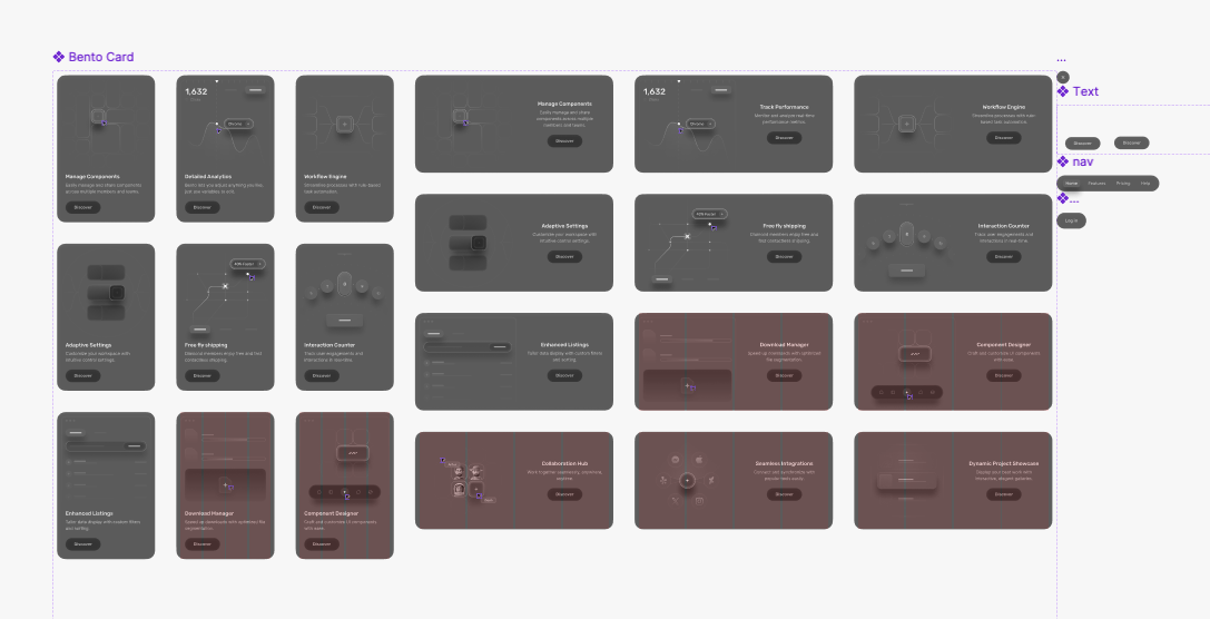
In a traditional workflow, a designer might define the brand palette, typography, spacing rules, button states, card styles, icons, input styles, and layout grids. Then they create components from those rules. A testimonial card, pricing card, modal, or navigation bar can be reused and adapted without starting from scratch.
If a new page needs a pricing section, the designer does not invent a new pricing card. They pull the existing card from the component library, adjust the content, and maybe add a variant. That discipline is what keeps a website coherent as it grows.
Visual reference
Use Figma, Stitch, sketches, or screenshots to name the direction before code starts.
Design tokens
Translate the look into colors, type, spacing, radius, surfaces, and motion rules.
Component library
Build reusable cards, modals, CTAs, tables, media blocks, and post sections.
Publishing system
Assemble pages and posts from shared parts, then QA every breakpoint before release.
- Component: a reusable design block with a defined job.
- Variant: a controlled version of a component, such as primary button, secondary button, featured pricing card, or compact CTA.
- Instance: one usage of a component on a specific page.
- Library: the shared source of truth for components.
- System of record: the place where teams can see what exists and how it should be used.
Tools like Google Stitch can help marketers explore this visually before asking an agent to build. Treat those outputs like a sketch or prototype, not a final architecture. The best handoff is not “copy this exact screen.” The best handoff is “use this visual direction to build reusable parts.”
The vibe coding version
In a vibe coded workflow, your prompt becomes part design brief and part product requirement. The agent can write the code, but you need to tell it what kind of codebase you want to own afterward.
That means naming the reusable surfaces up front. If your site will need landing pages, pricing pages, legal pages, podcast posts, how-to posts, and use case posts, say so before the first build. If you know future pages will reuse screenshots, app-style cards, comparison tables, FAQs, and CTA bands, ask for those as shared components.
Component library prompt
Create shared website primitives before creating final pages. I need reusable sections for hero layouts, feature cards, pricing cards, FAQ accordions, comparison tables, CTA bands, post templates, video cards, and screenshot blocks. Keep naming obvious. Do not create page-specific components unless a shared component cannot reasonably support the use case.
The point is not to slow the project down. The point is to make the next page faster. A good first build creates a runway for every future build.
Copy/paste prompts for a scalable vibe coded website
The following prompts are intentionally plain. Use them at the beginning of a project, when requesting a new page, or when an agent starts drifting into ad hoc choices.
Project setup prompt
Build this website as a maintainable marketing system, not a set of isolated pages. Start by identifying the core audience, page types, reusable components, design tokens, content models, and QA checks. Prefer simple HTML/CSS/React patterns over heavy libraries. Make future copy, pricing, posts, and CTA pages easy to update.Design system prompt
Define a lightweight design system for this site: colors, type scale, spacing, border radius, card styles, button styles, form styles, table styles, motion rules, and responsive breakpoints. Use these rules consistently across every page. If a new visual pattern is needed, explain whether it should become a reusable component or stay page-specific.Page template prompt
Create this page using existing shared components wherever possible. Before adding new code, list which existing components can support the layout. If a new component is required, make it reusable for future pages and document the content fields it expects.Maintenance prompt
Review this page for maintainability. Flag duplicated styles, one-off components, unclear naming, heavy dependencies, hard-coded content that should be data-driven, and layout choices likely to break on mobile. Recommend the smallest changes that make the page easier to update later.AGENTS.md instruction block
When editing this marketing site, reuse existing design tokens, shared components, and page templates before creating new patterns. Keep code lightweight and easy to navigate. Do not add a dependency unless the feature clearly needs it. Before finalizing, check desktop, tablet, and mobile layouts for overflow, text collisions, and inconsistent spacing.What not to do
The most common failure mode is one ad hoc feature after another. The page looks good in the preview, so the team keeps going. Then a second page needs a similar section. The agent builds a slightly different version. A third page needs another version. Soon the site has five button styles, four card systems, two table layouts, and no obvious place to make a global change.
- Do not approve every one-off surface because it looks fine once. Ask whether it belongs in the component library.
- Do not let every page carry its own CSS personality. Strong websites have variety inside a shared system.
- Do not add heavy animation or UI libraries by default. Most marketing pages need simple reveal, fade, hover, and accordion patterns.
- Do not treat screenshots as the only source of truth. Screenshots are useful references, but editable components are better for long-term iteration.
- Do not skip QA because the first viewport looks good. Check mobile, tablet, desktop, and real content length.
A suggested workflow for marketers
A practical workflow can stay simple:
- Use Figma, Google Stitch, screenshots, or rough sketches to explore the visual direction.
- Ask the agent to translate the direction into a design system and component inventory.
- Build one high-priority page using shared components.
- Use that page to test spacing, responsiveness, visual tone, and content editing.
- Only then create more pages, templates, and post categories.
- Keep a maintenance file that tells future agents what to reuse and what not to change casually.
This is very close to how a traditional team would move: strategy, design system, component library, page templates, implementation, QA, release, iteration. Vibe coding compresses the loop. It does not remove the need for the loop.
The better standard
Vibe coding is powerful because it gives marketers direct access to production speed. That is also why it needs taste, structure, and restraint.
The professional standard is not “can I get a website generated?” It is “can I build a website that my team can keep improving?” The answer depends less on the first prompt and more on the operating system around the prompts: shared components, clear terminology, lightweight code, stable templates, and honest QA.
If you borrow the best parts of Figma and traditional web development, vibe coding stops being a pile of outputs and starts becoming a real publishing system.